To have a nice bookstore in the living room, the hallway or bedroom does not depend only on the choice of bookstore but also how you decorate or view it. And for that, to make your bookstore look like a magazine, H&M offers us some very valuable advice.
Whether it looks crowded or very empty is a matter of aesthetics and necessity. It may be that your library serves to contain a large collection of books, magazines, records … Other times, more than a container, it will serve as an exhibition of your most valuable objects. In any case and regardless of the size of the bookstore, (the digitization of books and magazines has led to a significant reduction in the size of our bookstores), the important thing is that its content looks orderly or more than ordered, make it look organized.
Something that seems relatively easy (a little effort and dedication), but if you want a result of ten it will help you to follow the advice of H&M Home.
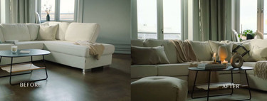
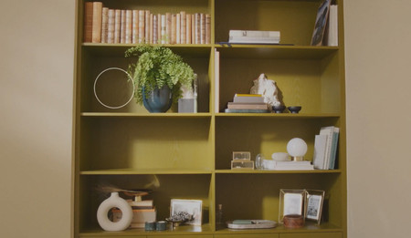
Start by placing the books
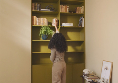
Normally, the library contains books. To start you can organize them by sizes and groups on different shelves. Here remember the trick of the stylists and if you do not like the result or the excessive colors of the loins, try to turn them around. The edge of the edges has a homogeneous color.
Organize the books in different positions (vertical, horizontal, showing the cover …)
To give dynamism and rhythm, try placing books in different positions, not just vertically. They can be vertically on a shelf and in other spaces horizontally or even, your most beautiful books can be put with the cover in view.
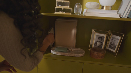
There must be at least three objects on each shelf
The rule of three to compose a corner or a surface with beautiful objects also applies to the shelves of the bookcase. Otherwise they will look empty.
Add a personal touch to every shelf
Small decorative objects that mean something to you, family photographs … anything that has meaning for you and that you like to see will often have space in the library, which will also make it more yours.
Along with this rule, it should be added that include trend objects and plants and small pots to update it. Mixing personal, vintage objects with other current ones is the key so that it does not look outdated.
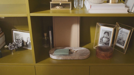
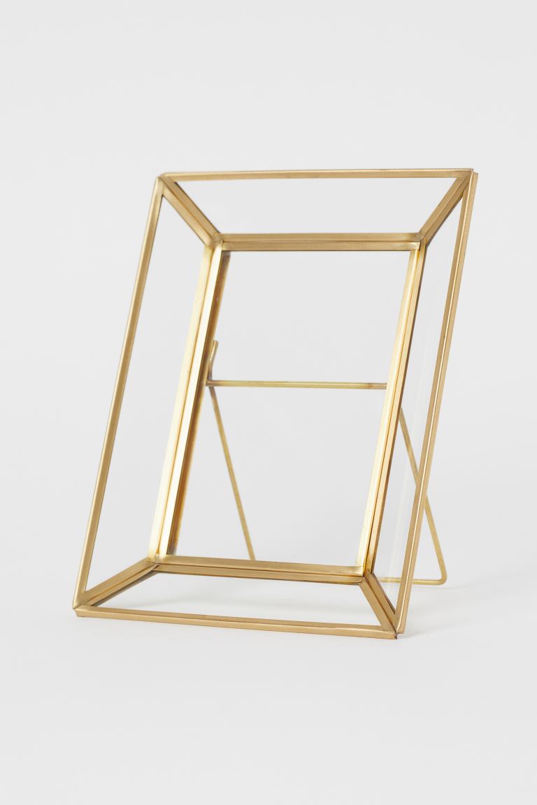
For you to frame your best photos, H&M Home glass and metal frame € 14.99
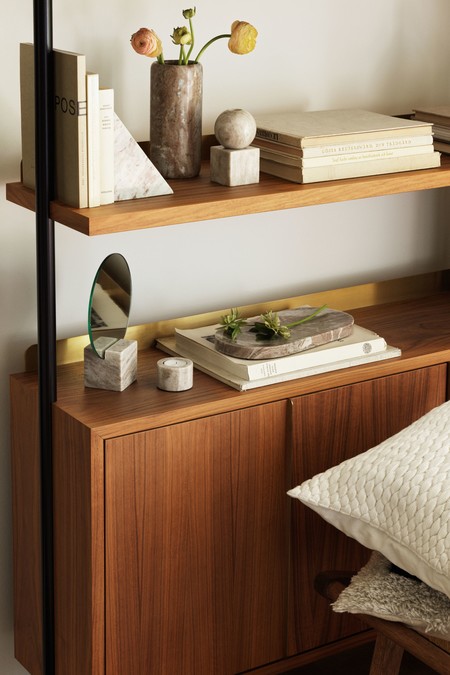
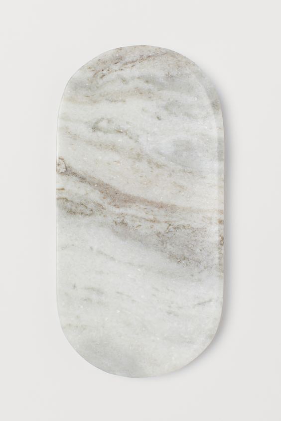
Rounded edge marble tray € 19.99
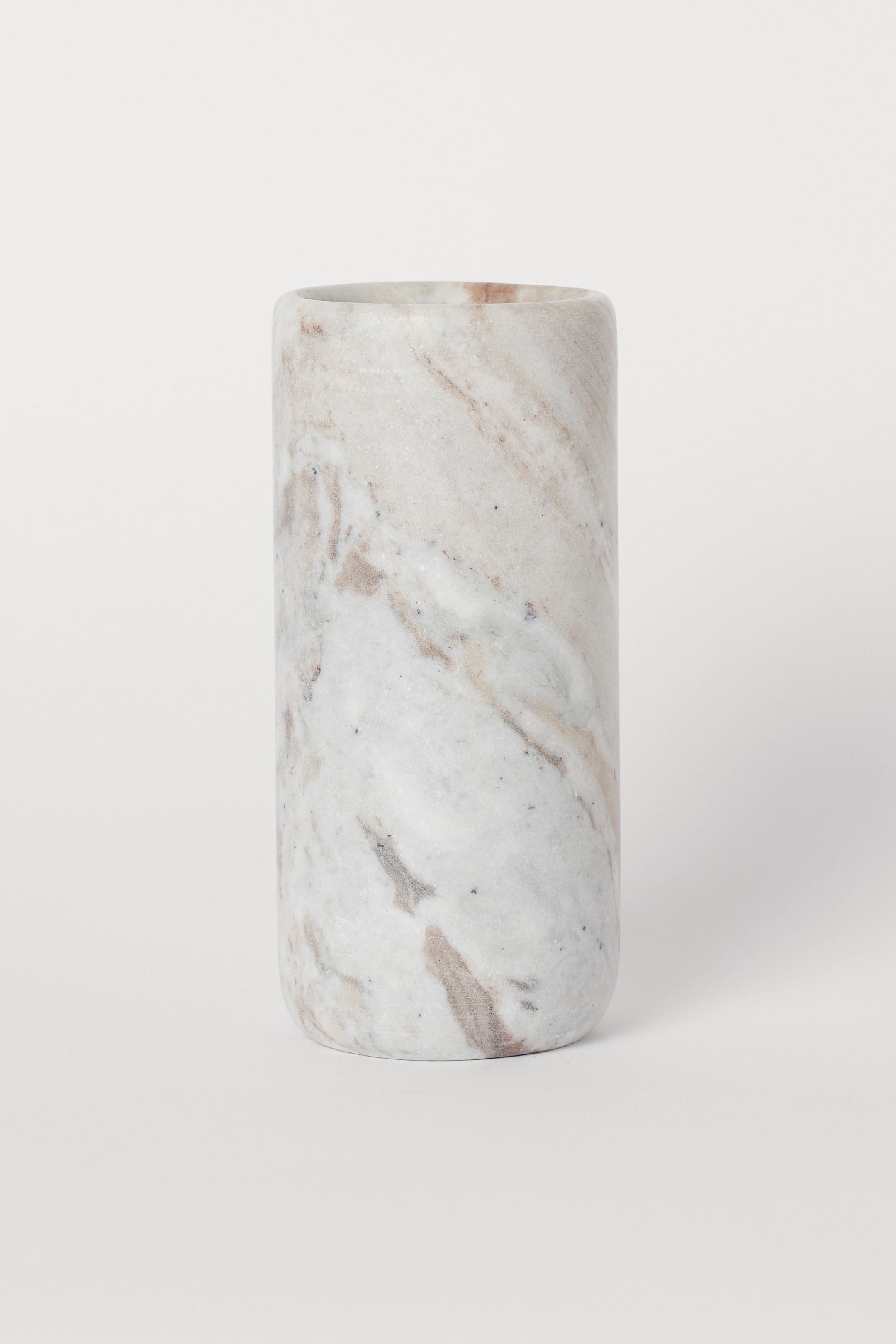
The cylindrical marble vase is 8.5 cm and 20 cm high € 29.99
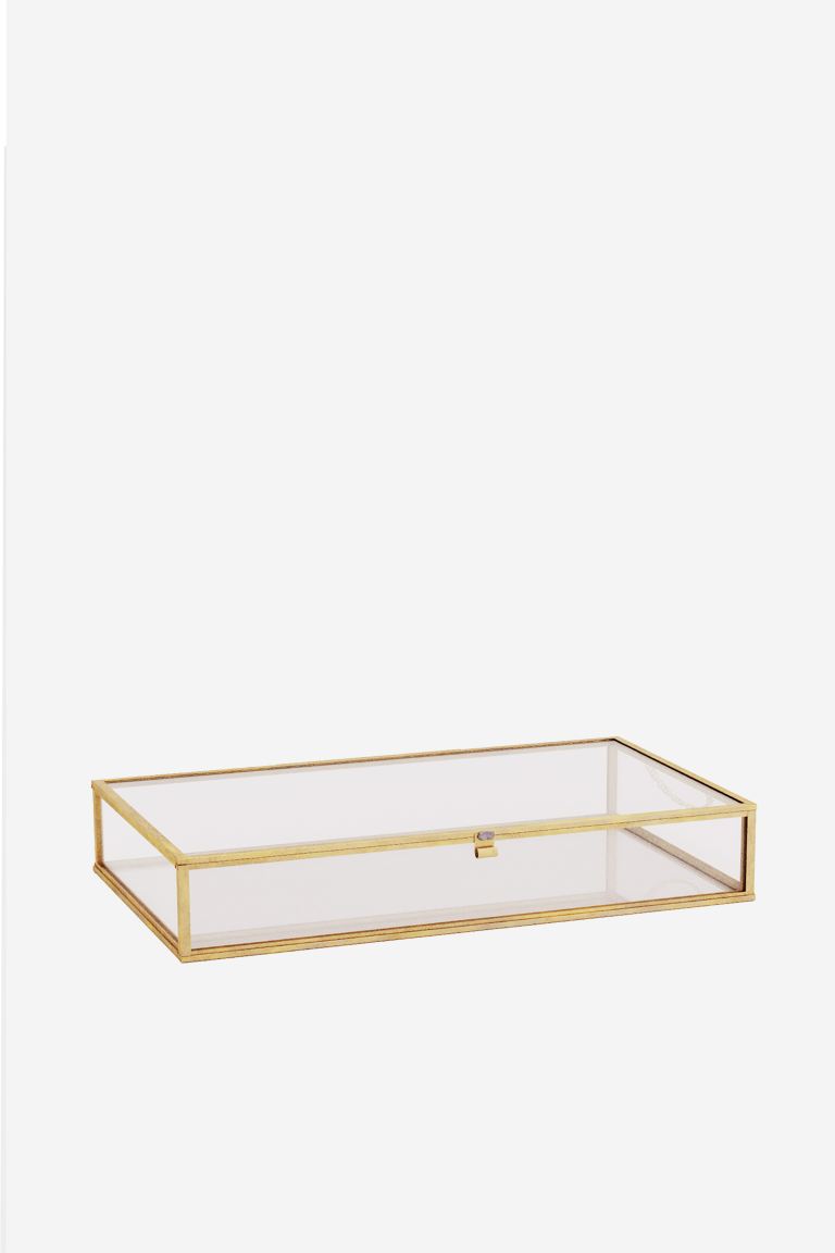
A glass and gold box to display your smallest details € 19.99
Let objects breathe playing with emptiness – full
It is about finding a balance between excessive crowding and decorative nihilism (which also means a loss of storage space). You could say that the key is in the middle.
It will help you to stay away from the library several times and check how the result is turning out during the process.
And so, if you follow these tips, it will be very easy for you to enjoy your magazine house
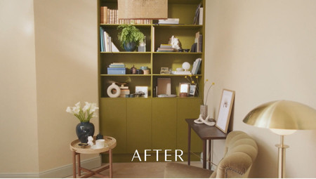
.
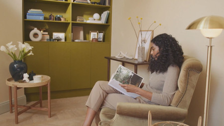
Here the complete video.
Similar in Decoesfera | Tricks to make your living room look bigger
Your classroom under examination; six criteria your salon must meet to make it look like a magazine

