If our house has small rooms, many times we have to settle because we cannot expand them, but what is always feasible is to use strategies to make achieve a feeling of greater amplitude. That will not mean that we have more space, but it will provide a more comfortable environment thanks to the visual effect.
When it comes to seeking inspiration for decorate a bedroom, we can take a look at hotel rooms. True, they tend to be cooler and more impersonal than a house, but they use many decorative tricks to get better their real dimensions or the symmetry of their forms and in that sense they can be of great help.
Mirrors that provide depth
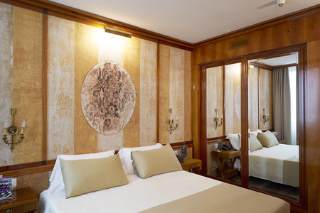
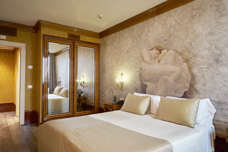
A classic when it comes to expanding spaces is the use of a mirror. We decide where we want to put it in function of the sense in which we want to give depth to the room, normally it will be interesting to place it parallel to the longest wall and perpendicular to the narrow one to visually enlarge the smallest.
Contrast colors
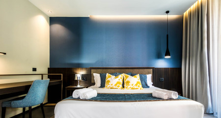
Something similar we can do with color contrast. Instead of painting the entire room in one color, we can paint a wall in a dark impact tone and in light tones, especially white, the rest. In the photo on these lines we can see an example of the Altido Smart Boutique Aparhotel in Milan.
Impact murals with effect
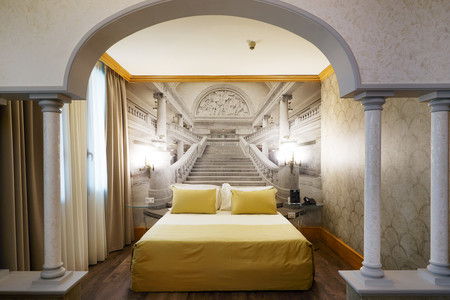
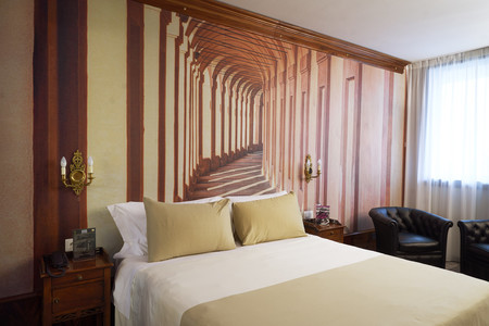
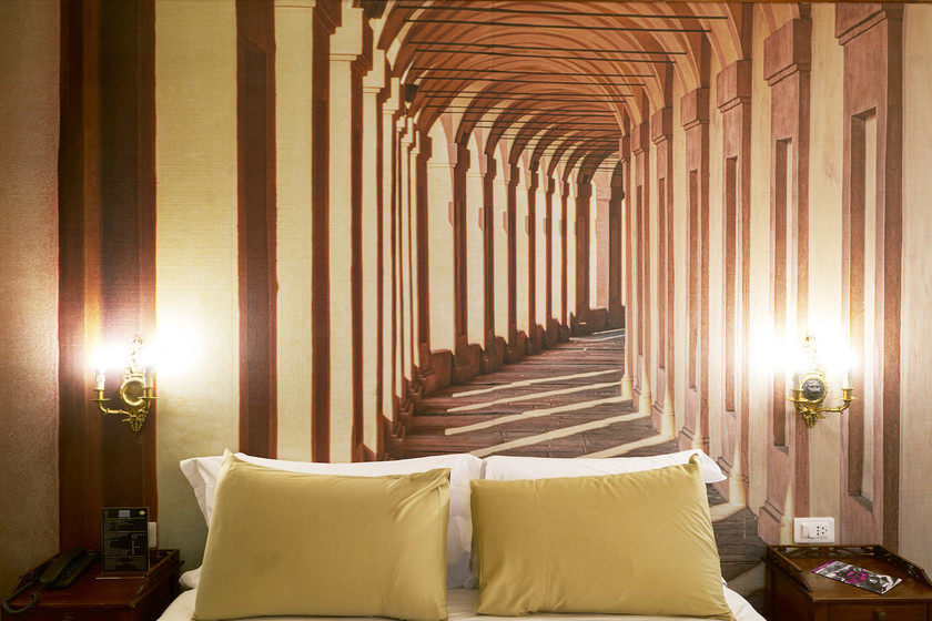
A more original idea is to use a mural that provides that effect. Today’s printing on wallpapers has a wonderful quality and if we choose the right image we can make it appear as an extension of the real space. In the Hotel Leon d’Oro we can see good examples of murals of that type from the Wallpepper firm, such as those in the photos on these lines.
Horizontal and vertical lines
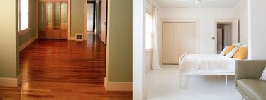
Another idea in the same line of color contrast is the use of stripes on the wall or floor. As with clothing, in decoration the painted horizontal or vertical lines They allow us to stylize or shorten the dimension we want. Even if the floor is made of wood (or imitation) it is important to think in which direction the “boards” are placed to achieve the effect of amplitude in the desired direction and not vice versa.
Less is more
And we close with another very basic detail. If the hotel rooms often seem larger than ours it is, in addition to because they usually use light colors, because they have fewer things. If we accumulate many things in sight in a space the feeling of overwhelm is greater, while if we reduce the number of elements in sight we have a feeling of greater amplitude. Furniture is essential, but chosen based on good planning and without overloading them.
Photos | Hotel Leon d’Oro, Altido and Wallpepper

