What are the mistakes not to make when furnishing a rectangular living room? Here’s how to create a valid furnishing scheme, without wasting the available space. Find out the 10 most common mistakes that should be avoided.
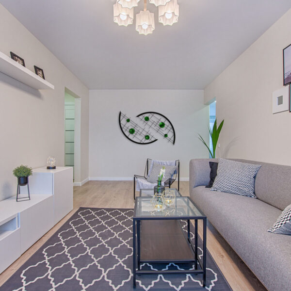
If you are struggling with the furnishings of a rectangular living room, you could commit accidentally a series of errors that would make your work useless. Of course, you don’t necessarily have to be an expert in the sector to be able to furnish your home!
However, using valid criteria to be applied to the plant of your living room, you will get in any case very good results. For this, we thought we would list the 10 most common mistakes in which is easy to run into when decorating a rectangular living room: find out immediately Which ones are they, and run for cover before it’s too late.
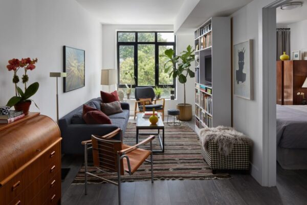
1. Choose oversized furniture
A rather common mistake leads us to think that the furniture in the living room must include standard pieces, which absolutely cannot be missing. Choose oversized furniture, regardless of the space available, it’s a mistake that goes absolutely averted in a rectangular living room.
Also read: 10 Common Problems Happening in the Kitchen You Should Fix Quickly
Decide in advance what are the indispensable pieces, but with tape measure in hand establish the exact measurements of each piece of furniture.
For example: would you like to include a dining table and important chairs? Instead opt for a large rectangular table with standard measures, prefer an extendable model is match of resealable chairs.
There is no point in saturating the space with furniture that would remain unused most of the time. However, when you need them, you will know that you can count on an extendable table and ready-to-use chairs.
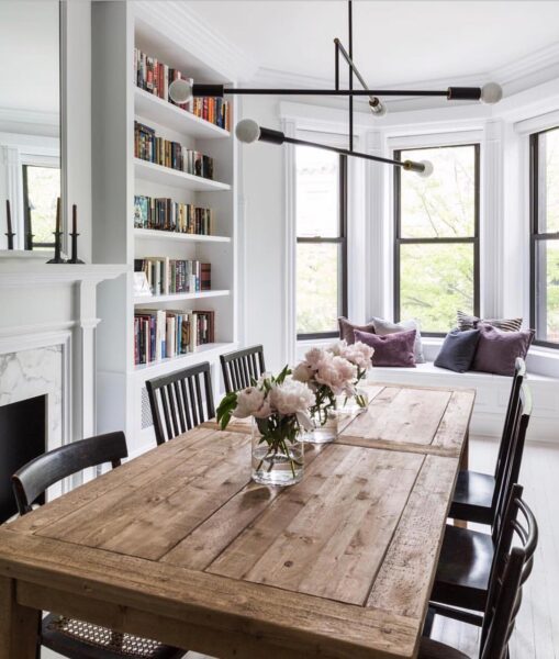
2. Suffocate the environment with too much furniture
Break up to take hand inserting too many furnishings is another mistake very common, often dictated by the haste of want to furnish the livingroom in a complete way. Whether it is large or small, the rectangular living room always requires a well-designed organization of spaces.
Before furnishing the entire living room, try to think about what are the elements you can’t do without: an equipped wall, the sofa, the armchairs and the low table are already furnishings that, by themselves, fill a large part of the space.
Only when you will have more clear the function to be assigned to the various zones of the living room, you will be able choose additional furniture and accessories, which will complete your decor.
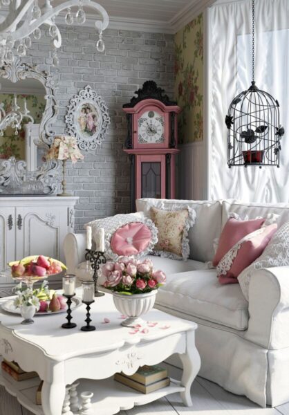
3. Bulky sofa
The sofa is no doubt the most important element of the living room, the furniture around which the entire organization of the space revolves. If you’ve spotted the point exact in which to place it, measure the necessary space to ensure that it is not too bulky.
You might be interested in: Furnishing your home yourself: the 10 most common mistakes to avoid
Remember that in a rectangular living room the sofa should be placed in front of the television and never sideways to it. This means that if you are planning to buy a corner sofa, you will have to choose a model with small dimensions.
In any case it would be better to focus on a linear sofa with two or three seats, combining a comfortable pouf as an extra seat, which will be easier to manage and will not overwhelm the living area.
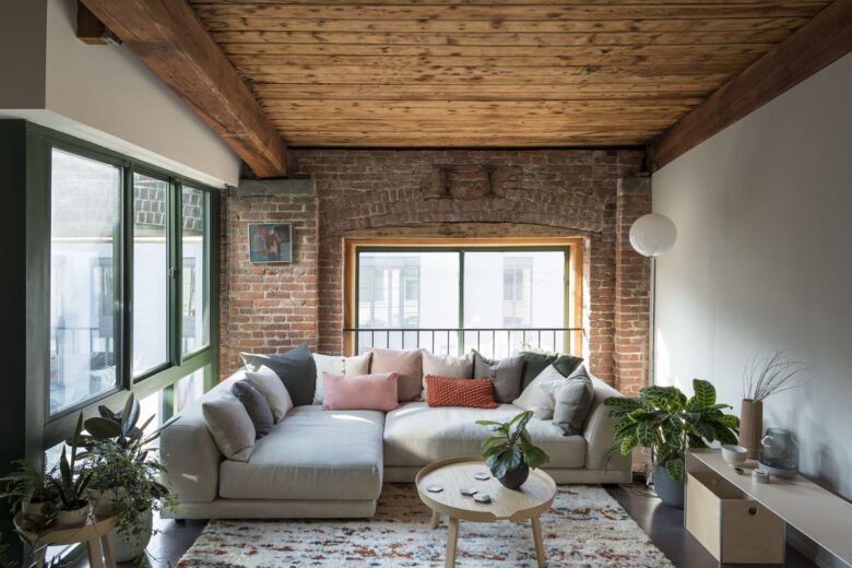
4. Place the tv between two windows
If you place the TV between two windows you will always be forced to look at it with the shutters down. The annoying ones flashes of light that are reflected on the screen they are not very suitable for eye health.
Do you want design advice on how to furnish? Join the group
The television, indeed, should be placed at a point where light never reflects directly on the screen. The advice is to insert it inside an equipped wall, and to fix the sofa or the armchairs always in front of it.
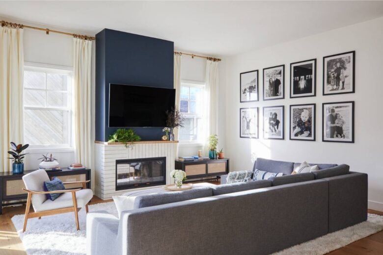
5. Divide the wall horizontally
Paint the wall horizontally it amplifies the perception of the rectangular plan even more, because it is one stratagem that serves to lengthen the walls. In the case of a long and narrow stay, this effect must absolutely be avoided: the risk is to make the room even longer and narrower!
In a rectangular living room you prefer always light and bright colors and paint the walls to full height, so to standardize the whole environment. The floor also contributes to improving the spatial perception: choose it in light tones and prefer large-format tiles.

6. Leave blank space in the center
Another common mistake in a rectangular living room is the creation of a perimeter furnishing scheme. In other words one is led to put all the furnishings along the walls, leaving the empty space in the center, in the belief that the room will seem larger.
Far from it: the final effect will be chaotic and messy, and the living room will seem smaller and poorly organized. Spaces go instead organized in a functional way, dividing the various areas with specific criteria (dining area, relaxation area, reading area, etc.). Don’t be afraid to fill the central space with furniture: the important thing will be to ensure a smooth transition between one area and another in the living area.
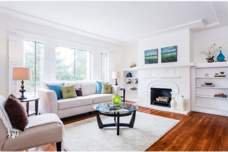
7. Tone-on-tone combinations
The combinations Tone on tone they are never a winning choice, and this is even more true in a rectangular living room. The final effect will be that of a boring and characterless environment, which will help only to a general flattening, very uninspiring. Little ones hints of color and the thoughtful use of patterns will give instead a dynamic touch and cheerful, which will certainly make your living room a more pleasant and welcoming place.
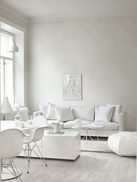
8. Baseboard too high
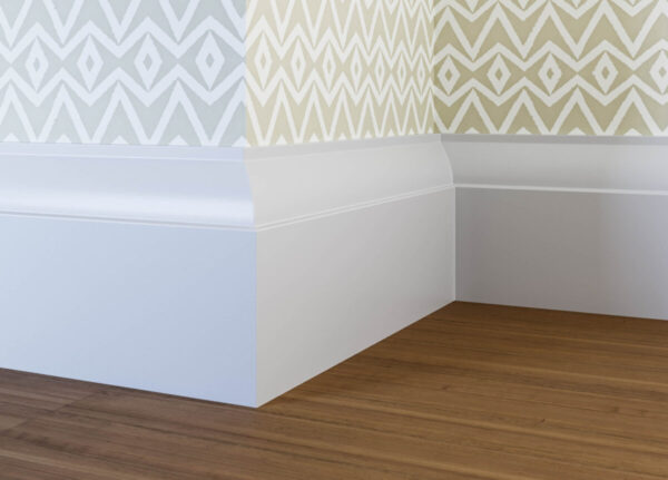
Often it is an element to which we never give too much importance, but in reality the skirting board serves to make the walls and floor uniform and helps to define the layout of the room. Choose a skirting decorative too high emphasizes the irregular shape of the living room and, in some cases, it reduces the spatial perception. Better to choose it low and in tone with the color of the walls: in this way they will appear taller and more slender.
9. Bad planning of spaces
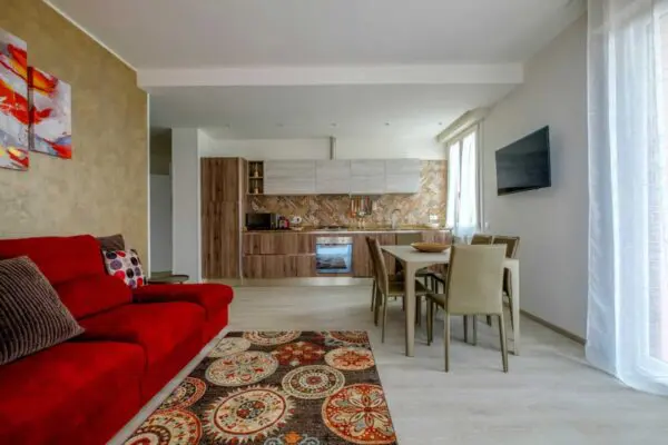
The living room areas must be divided according to the openings present in the room. In the following photo there are several design errors: the television screen is placed between two windows, the dining table is located just below the TV and the sofa has been relegated to the back of the room, along the wider wall, from where it is impossible to watch television.
In the case of an open space all this must be avoided with the ideal separation of the kitchen from the living room. Could use own the sofa like element to divide visually the two environments; moving the TV on the short wall and placing the sofa in front of it, the result would be not only more aesthetically beautiful, but also more usable and functional.
10. Choose only one light source
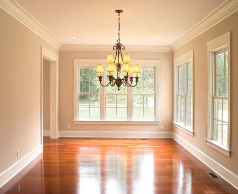
Claiming to illuminate a rectangular living room with a single central chandelier is quite utopian. In designing the different areas, choose a suitable light to illuminate that specific area: a floor lamp, a table lamp, wall sconces or a set of pendant lights, placed on the coffee table. In this way there is no risk that totally shaded areas remain, and better define the role of each area.
Rectangular living room errors: pictures and photos
Here are the mistakes not to make in a rectangular living room: browse the image gallery to review all the most frequent mistakes in furnishing a rectangular living room.


