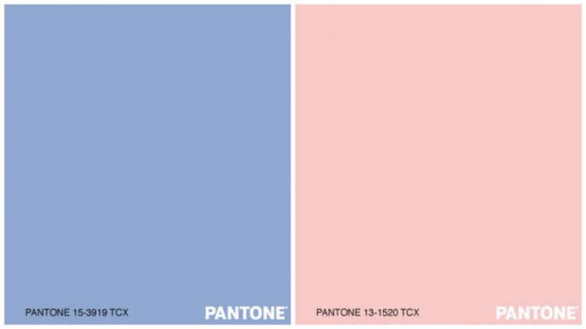
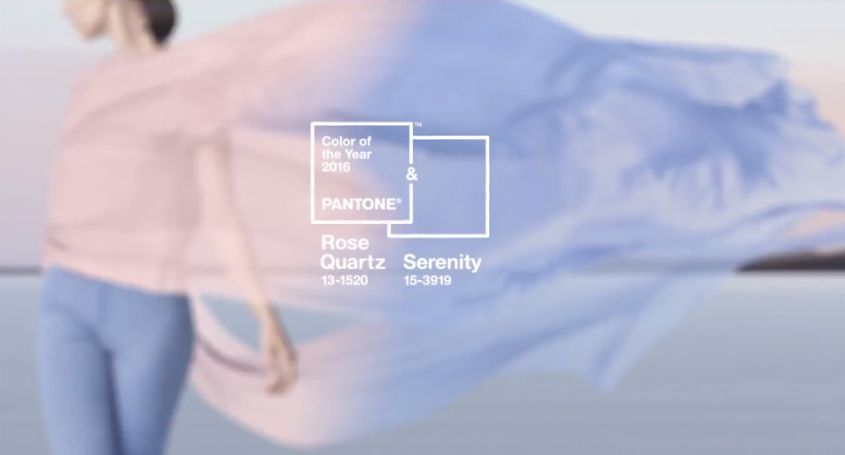
You want to know what the colors 2016 according to Pantone? The highest authority in terms of colors has announced that the Rose Quartz and theSerenity blue they will be the masters everywhere, even on fabrics, furnishings and accessories for the home. Two soft and delicate shades for the home born from the consumers’ need to rediscover well-being in the midst of the stress of modern daily life, also through the use of psychologically reassuring colors. The calming power of Serenity and the persuasive and delicate tone of the Rose Quartz will dress up the new year’s interior.
The 2016 sees for the first time the fusion of two tones: the Rose Quartz and theSerenity blue, therefore no longer just one PANTONE color of the Year.
The choice of these two colors is dictated by the awareness that in this moment more than ever, consumers are looking for psychological well-being as an antidote to modern everyday stresses. The use of shades Rose Quartz and Serenity psychologically manages to satisfy our desire for reassurance. These two colors demonstrate an intrinsic balance, an embrace of a warm pink with the tranquility of blue, which manage to bring a sense of well-being, order and peace.

Pantone 15-3919 Serenity
Light and airy, like the blue sky above us, Pantone 15-3919 Serenity has the power to relax with its calming effect, bringing a sense of relief even in moments of absolute stress. L’Serenity blue manages to transport us to an ethereal spatial dimension. The best color combinations 2016 with theSerenity blue are: Pantone 12-0752 Buttercup, Pantone 19-4049 Snorkel Blue, and Pantone 13-1520 Rose Quartz.
Pantone 13-1520 Rose Quartz
The soothing calming nature of the 2016 collections colors are led by Pantone 13-1520 Rose Quartz, a sweet but persuasive shade that conveys a sense of composure. Like a serene sunset, a flushed cheek or a newborn flower, the Rose Quartz reminds us to reflect on our surroundings during the spring and summer months, the most carefree time of the year. The best color combinations 2016 with the Rose Quartz are: Pantone 16-1548 Peach Echo, Pantone 15-3919 Serenity, Pantone 16-3905 Lilac Gray.
The interiors of houses, offices and commercial activities are already being tinged with this chromotherapy choice, and there are many companies that are proposing Rosa Quarzo and Azzurro Serenity furnishings and accessories. Foscarini proposes the playful and cheerful personality of the Binic lamp, designed by Ionna Vautrin in 2010, with new color proposals that embrace the Pantone 2016 trends. Pink and light blue but also other pastel colors for the 3107 chair collection of the 7 series, an icon of Nordic design and best seller for the Danish brand Fritz Hansen designed by Arne Jacobsen.
You want to know what the colors 2016 according to Pantone? The highest authority in terms of colors has announced that the Rose Quartz and theSerenity blue they will be the masters everywhere, even on fabrics, furnishings and accessories for the home. Two soft and delicate shades for the home born from the consumers’ need to rediscover well-being in the midst of the stress of modern daily life, also through the use of psychologically reassuring colors. The calming power of Serenity and the persuasive and delicate tone of the Rose Quartz will dress up the new year’s interior.
The 2016 sees for the first time the fusion of two tones: the Rose Quartz and theSerenity blue, therefore no longer just one PANTONE color of the Year.
The choice of these two colors is dictated by the awareness that in this moment more than ever, consumers are looking for psychological well-being as an antidote to modern everyday stresses. The use of shades Rose Quartz and Serenity psychologically manages to satisfy our desire for reassurance. These two colors demonstrate an intrinsic balance, an embrace of a warm pink with the tranquility of blue, which manage to bring a sense of well-being, order and peace.

Pantone 15-3919 Serenity
Light and airy, like the blue sky above us, Pantone 15-3919 Serenity has the power to relax with its calming effect, bringing a sense of relief even in moments of absolute stress. L’Serenity blue manages to transport us to an ethereal spatial dimension. The best color combinations 2016 with theSerenity blue are: Pantone 12-0752 Buttercup, Pantone 19-4049 Snorkel Blue, and Pantone 13-1520 Rose Quartz.
Pantone 13-1520 Rose Quartz
The soothing calming nature of the 2016 collections colors are led by Pantone 13-1520 Rose Quartz, a sweet but persuasive shade that conveys a sense of composure. Like a serene sunset, a flushed cheek or a newborn flower, the Rose Quartz reminds us to reflect on our surroundings during the spring and summer months, the most carefree time of the year. The best color combinations 2016 with the Rose Quartz are: Pantone 16-1548 Peach Echo, Pantone 15-3919 Serenity, Pantone 16-3905 Lilac Gray.
The interiors of houses, offices and commercial activities are already being tinged with this chromotherapy choice, and there are many companies that are proposing Rosa Quarzo and Azzurro Serenity furnishings and accessories. Foscarini proposes the playful and cheerful personality of the Binic lamp, designed by Ionna Vautrin in 2010, with new color proposals that embrace the Pantone 2016 trends. Pink and light blue but also other pastel colors for the 3107 chair collection of the 7 series, an icon of Nordic design and best seller for the Danish brand Fritz Hansen designed by Arne Jacobsen.


