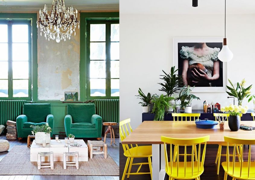
The Pantone trends 2018 reveal i colors for furniture which we should prefer if we want to create a trendy house full of style and personality. As every year, the well-known institute releases its color reports rich in avant-garde and unexpected colors with which to give a refined touch to any environment, from the entrance to the bedroom. Some of Pantone colors 2018 they are certainly suitable for fabrics, which we can also change quite easily, while others, the more neutral and sober ones, are perfect for walls and even floors. Let’s see in detail which are the color trends for furniture 2018 according to Pantone.
Blooming Dahlia, a delicate pink
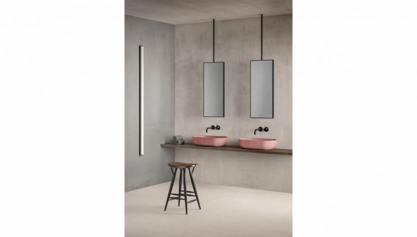
The Blooming Dahlia It is one of Pantone colors more delicate and certainly feminine with which you can dress yours house in 2018. It is a pink with an antique charm, ideal for cushions and upholstery but also for much more. If you particularly like it, you can make more important and decisive choices, such as buying sinks or sanitary ware in this shade.
Cherry Tomato, a strong red
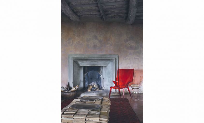
The red and this time Pantone offers us the variant Cherry Tomato, which is definitely brighter and more intense. To give its best we suggest you prefer something that is made of a plastic material, which gives reflections and transparencies.
Chili Oil, the burgundy that enchants
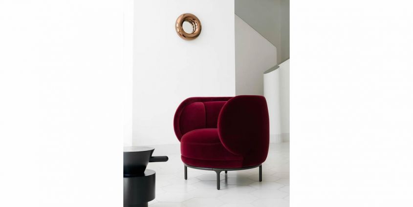
The red scale has been suitably well explored by Pantone which for 2018 offers us the version Chili Oil which turns to burgundy. To get the best results, choose fabrics such as velvet and you will have sophisticated and chic environments.
Arcadia, the retro green
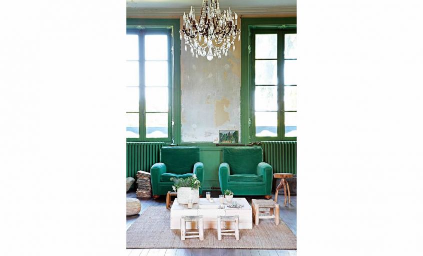
L’Arcadia is a refined and ancient shade of green that has been inserted between the Pantone 2018 color trends for the home. It is certainly very suitable for historic homes, where you can even repaint doors and windows but alternatively fabrics and upholstery can play an important role.
Harbor Mist, the gray you like
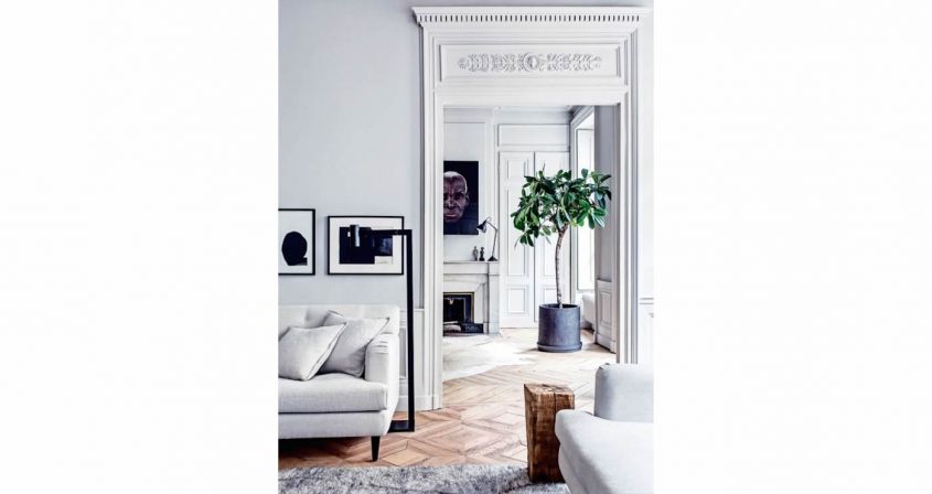
Between new Pantone colors 2018 there are also some colors that the institute has defined as “classic”, that is the one that everyone should use and always have at hand. In this case we are talking aboutHarbor Mist which is a very light gray, cold but at the same time delicate that goes well with all the other nuances. It is therefore ideal for walls and for some design elements and furniture, such as those in the kitchen.
Mauve, the delicacy of pastels
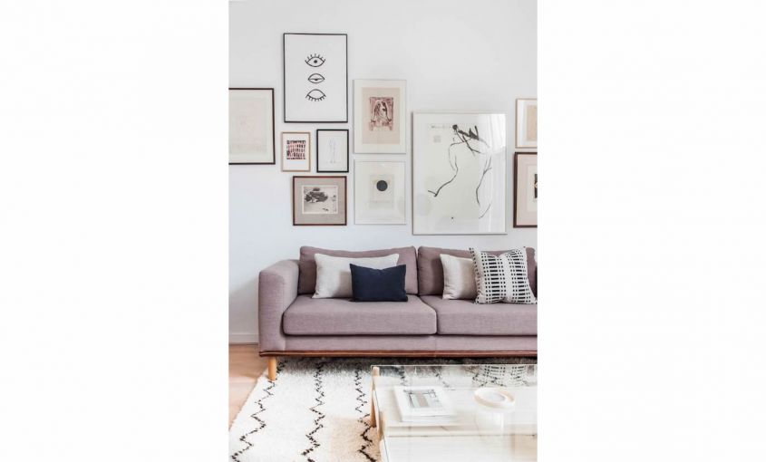
Another extremely delicate color is Mauve, a pale and light pink that tends to mauve and which is ideal for those who adore one Nordic style of furniture. Perfect, therefore, for sofas, carpets and armchairs.
Pink Lavander, the other side of pink
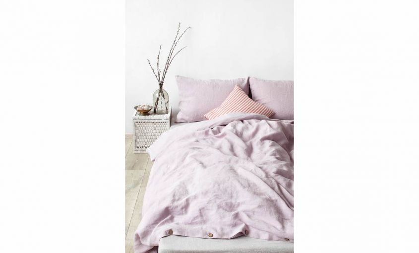
Another variant of pink is the Pink Lavander which exactly like the Mauve you can use without making too many worries. A good solution would be to choose some bedding, then a nice set of duvet covers and pillowcases.
Lime Punch, a lively color
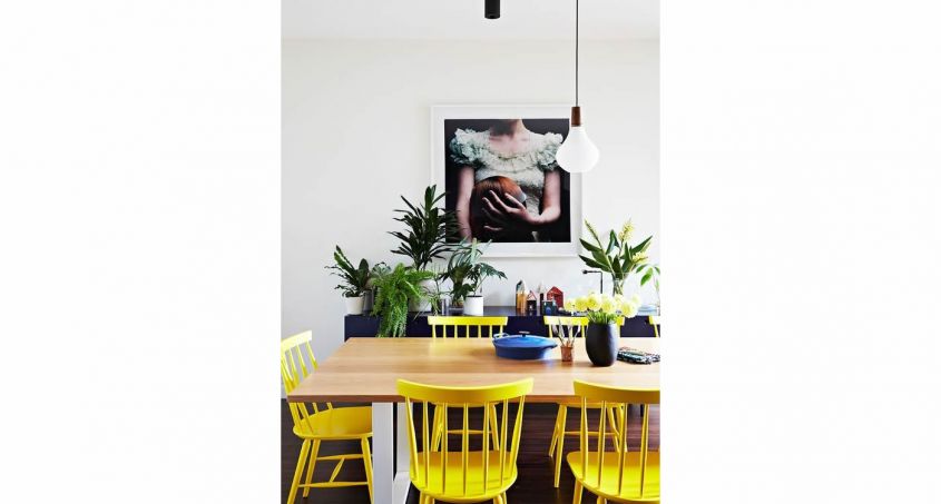
Do you want something that has a color that stands out? Try decorating with yellow, even better if with fluorescent undertones. This is the Lime Punch, one of the Pantone home colors 2018 that could revive your home with taste and style.
Warm Sand, the beige that conquers
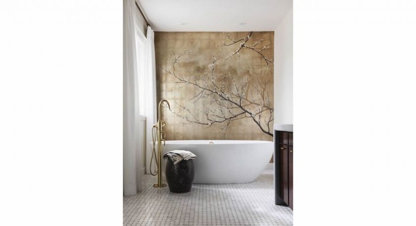
Finally, in the palette of the well-known color institute we also find another very light and sober color that you can use without making yourself too much trouble. This is the Warm Sand, a warm beige and cozy that looks good in any environment, even in the bathroom.

