The list of 10 mistakes not to make when furnishing a modern kitchen. What to avoid and what absolutely must be there, from accessories to appliances.
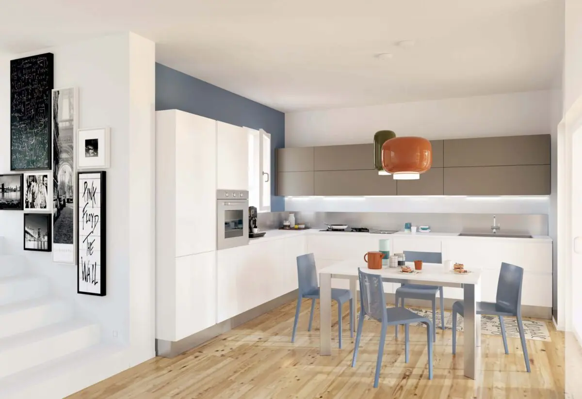
From the experience of our ancestors we have learned that the kitchen, especially a modern one located in an open space, it is the heart of the house. From a room used for the preparation and consumption of meals, it has been transformed into a place where friends are welcomed, work and homework done with the children. Here because the search for functionality has become a priority, without for this leave out the design.
A modern kitchen is made from durable materials, the structure is often in metal and the doors in laminate or melamine. In recent years it has been increasingly chosen to combine wood, for a color contrast with a sure wow effect. This style is enhanced by natural light, but there is no shortage of accent lighting points with LED spotlights, themed chandeliers and / or ceiling lights.
Read also: Ideas for furnishing and organizing an Open Space
Regarding the choice of colors, this it must fall on shades such as black, gray, white, but also red, dark green and mustard yellow.
In a modern kitchen the most important feature is the usability of the spaces; it follows that their organization must be treated in detail. If you also don’t want to risk making mistakes, read this useful decalogue now.
1. Misuse of space
A modern kitchen aims to guarantee comfort and practicality to its users. For this reason, design errors that do not allow to make the most of every centimeter are to be avoided.
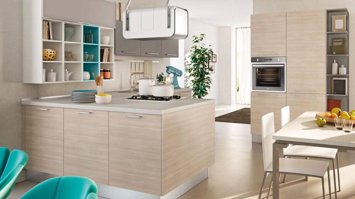
You know, space is never enough in the kitchen, both in terms of storage compartments and shelves. In the case of the style we are analyzing, a valuable aid is the island or peninsula (when room size is limited). By adding this additional workspace, all the activities to be carried out will benefit.
Another idea to think about are the full-height wall units or positioned up to the ceiling in order to make the most of vertical space too.
2. Incorrect size of surfaces
Trying to increase spaces and surfaces at one’s disposal, one risks running into the opposite error, that is to say making the space too full of furniture and consequently cramped.
You may be interested in: Living room with open kitchen
Let’s see some examples. When kitchen cabinets are chosen too deep, they inadvertently become too close to the face and it is easy to imagine how unpleasant if not dangerous at times this is.
Also the position of the hood becomes crucial. Placing it at the height of the forehead forces the person who is cooking to bend down to access the hob. For a modern kitchen there are many solutions of concealed hoods or in any case positioned at different heights, so it will not be difficult to avoid making this mistake.
3. Reserve little space for the work surface
In a modern kitchen food processors and other appliances cannot be missing, more or less large in size, for daily use. How easy it is to imagine, their ideal location, always with a view to maintaining a high level of usability of the spaces, it is on display on the countertop.
Do you want design advice on how to furnish? Join the group
It goes without saying that this cannot be too small, even less non-existent as sometimes happens. Therefore, in the design phase it will be important to allocate the right space to an adequate work surface.
Yet, contemporary interior designs suggest a 70 cm deep support surface. This not only allows you to work with more space, but also gives the possibility of lowering the wall units up to 48 cm from the top, not just a question in terms of ease of access to the content within them.
4. Do not study the arrangement of appliances
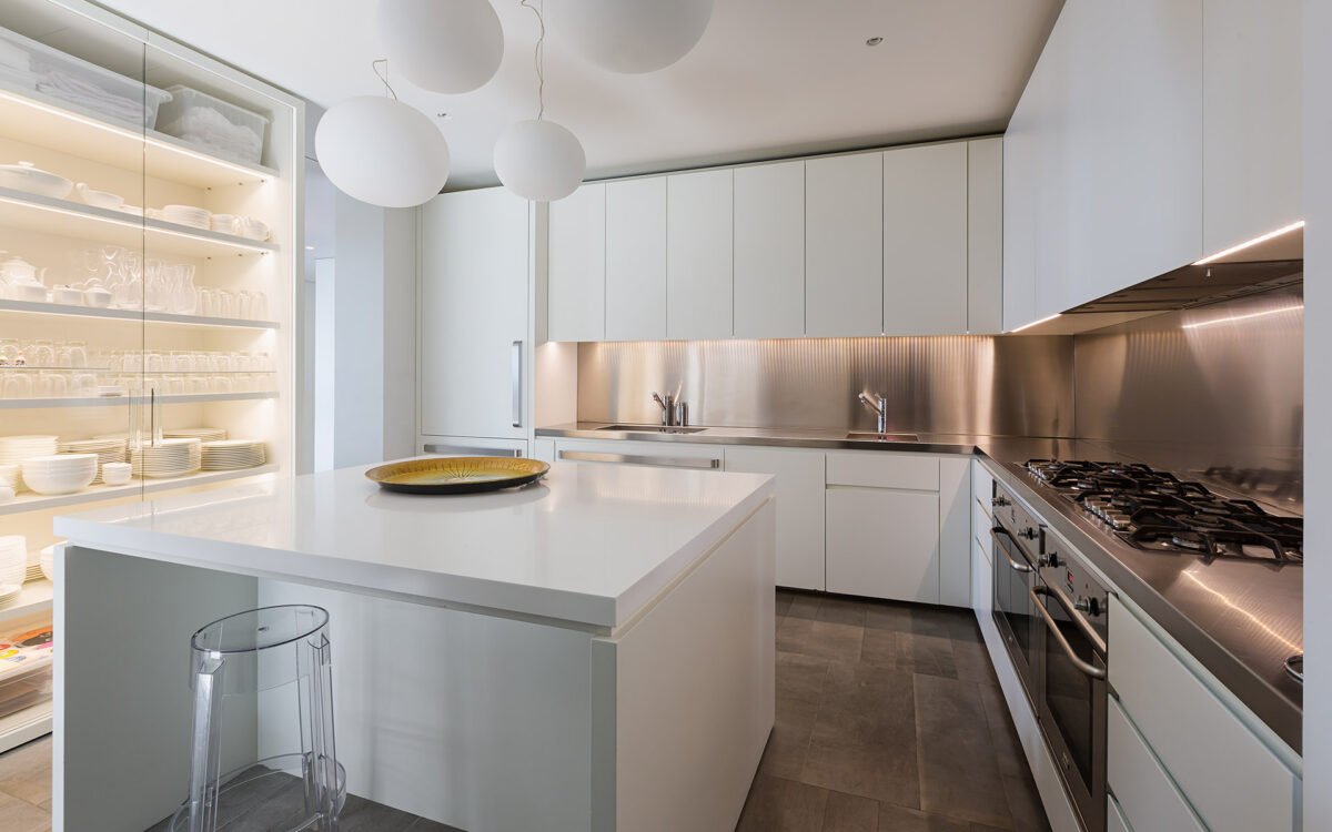
As we have already had occasion to mention, appliances are a constant a bit in all modern kitchens. For this, their arrangement cannot be left to chance.
Moreover, in many cases they choose design and it would be a real shame to keep them hidden in a piece of furniture.
5. Using the wrong materials
The style of a modern kitchen can be easily recognized by looking at the materials chosen for its realization.
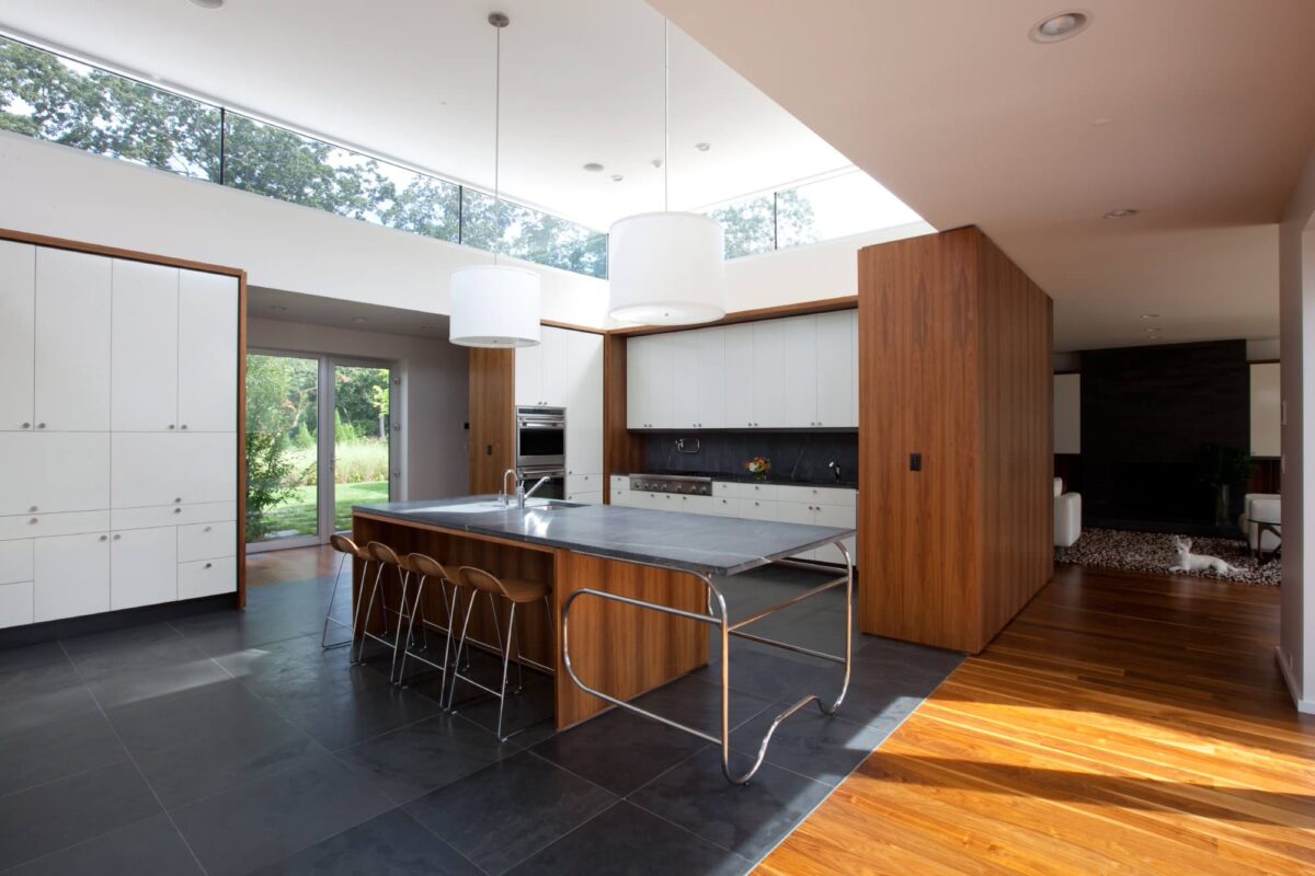
In the next photo, a splendid example of how modern meets traditional, especially in the central island with a concrete worktop.
6. Furnish with dark colors in small rooms
At this point you will have got to understand that the typical colors of a modern kitchen are dark ones. However, this does not mean that there may be exceptions to this rule, above all in the case of small rooms.
Indeed, for a modestly sized kitchen it would be a big mistake to choose a black or gray solution; much better a white structure and an alternation of colors created with the coverings or furnishing accessories.
7. Leave a style undefined
All those described so far are useful tips to follow, but they will not help if the style of your kitchen is not well defined.
A modern kitchen has clean and essential lines, few furnishings and no crockery in sight. It is important not to create jumble of objects, but we will see this in the next point.
8. Overdo the decorations
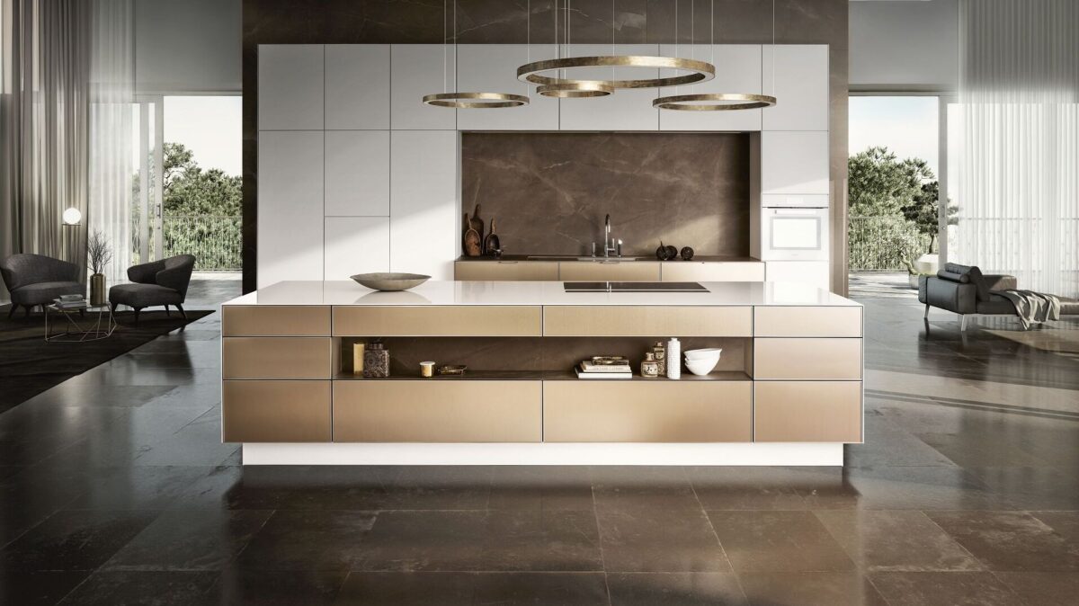
There are many modern styles, from minimal to industrial, but the characteristic that unites them all is the absence of frills.
Be careful not to overload the visual space with too many decorations, better to keep a sober and clean line.
9. Underestimate the lighting
We now come to a focal point, in every sense: enlightenment. The ideal is natural and helps to make the atmosphere jovial and convivial.
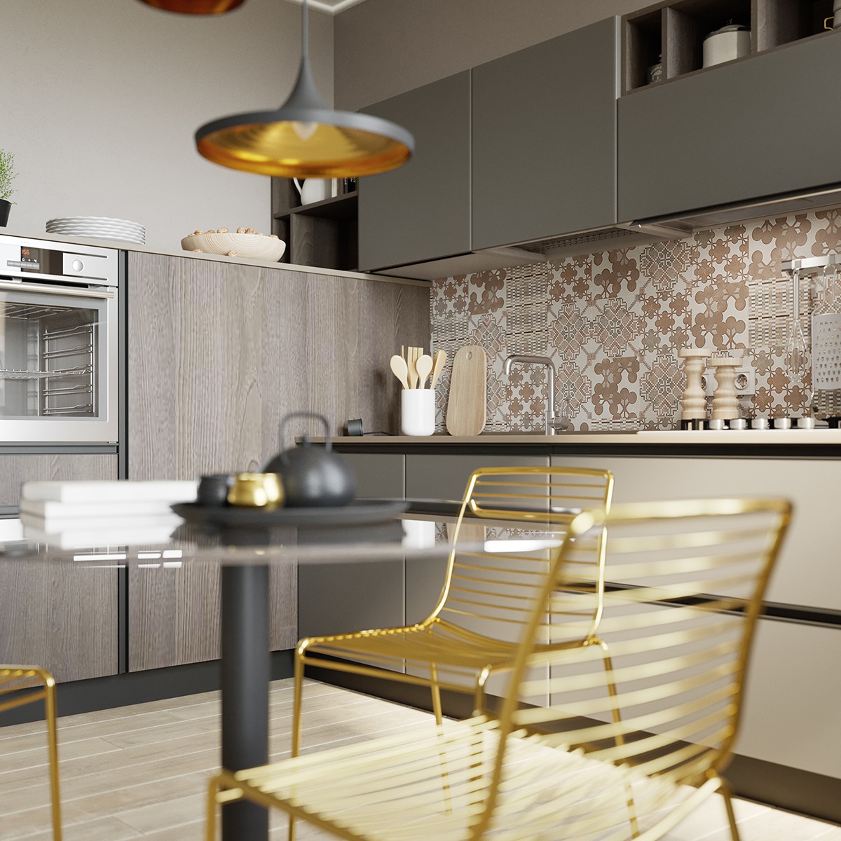
For the evening, a nice central chandelier (especially if the table is present) is be careful not to forget LED spotlights in correspondence with wall units and doors.
10. Choosing your curtains badly
As a result of natural light, can not miss the curtains. The most suitable ones are in light materials, with geometric motifs (not floral) or in solid colors.
Panel curtains are very popular, even if you have a window and not a balcony.
Furnishing a modern kitchen, 10 mistakes not to make: images and photos
The 10 mistakes not to make when furnishing a modern kitchen summarized in a photo gallery full of ideas and suggestions.
The list of 10 mistakes not to make when furnishing a modern kitchen. What to avoid and what absolutely must be there, from accessories to appliances.

From the experience of our ancestors we have learned that the kitchen, especially a modern one located in an open space, it is the heart of the house. From a room used for the preparation and consumption of meals, it has been transformed into a place where friends are welcomed, work and homework done with the children. Here because the search for functionality has become a priority, without for this leave out the design.
A modern kitchen is made from durable materials, the structure is often in metal and the doors in laminate or melamine. In recent years it has been increasingly chosen to combine wood, for a color contrast with a sure wow effect. This style is enhanced by natural light, but there is no shortage of accent lighting points with LED spotlights, themed chandeliers and / or ceiling lights.
Read also: Ideas for furnishing and organizing an Open Space
Regarding the choice of colors, this it must fall on shades such as black, gray, white, but also red, dark green and mustard yellow.
In a modern kitchen the most important feature is the usability of the spaces; it follows that their organization must be treated in detail. If you also don’t want to risk making mistakes, read this useful decalogue now.
1. Misuse of space
A modern kitchen aims to guarantee comfort and practicality to its users. For this reason, design errors that do not allow to make the most of every centimeter are to be avoided.
You know, space is never enough in the kitchen, both in terms of storage compartments and shelves. In the case of the style we are analyzing, a valuable aid is the island or peninsula (when room size is limited). By adding this additional workspace, all the activities to be carried out will benefit.
Another idea to think about are the full-height wall units or positioned up to the ceiling in order to make the most of vertical space too.

2. Incorrect size of surfaces
Trying to increase spaces and surfaces at one’s disposal, one risks running into the opposite error, that is to say making the space too full of furniture and consequently cramped.
You may be interested in: Living room with open kitchen
Let’s see some examples. When kitchen cabinets are chosen too deep, they inadvertently become too close to the face and it is easy to imagine how unpleasant if not dangerous at times this is.
Also the position of the hood becomes crucial. Placing it at the height of the forehead forces the person who is cooking to bend down to access the hob. For a modern kitchen there are many solutions of concealed hoods or in any case positioned at different heights, so it will not be difficult to avoid making this mistake.
3. Reserve little space for the work surface
In a modern kitchen food processors and other appliances cannot be missing, more or less large in size, for daily use. How easy it is to imagine, their ideal location, always with a view to maintaining a high level of usability of the spaces, it is on display on the countertop.
Do you want design advice on how to furnish? Join the group
It goes without saying that this cannot be too small, even less non-existent as sometimes happens. Therefore, in the design phase it will be important to allocate the right space to an adequate work surface.
Yet, contemporary interior designs suggest a 70 cm deep support surface. This not only allows you to work with more space, but also gives the possibility of lowering the wall units up to 48 cm from the top, not just a question in terms of ease of access to the content within them.

4. Do not study the arrangement of appliances
As we have already had occasion to mention, appliances are a constant a bit in all modern kitchens. For this, their arrangement cannot be left to chance.
Moreover, in many cases they choose design and it would be a real shame to keep them hidden in a piece of furniture.
5. Using the wrong materials
The style of a modern kitchen can be easily recognized by looking at the materials chosen for its realization.
In the next photo, a splendid example of how modern meets traditional, especially in the central island with a concrete worktop.

6. Furnish with dark colors in small rooms
At this point you will have got to understand that the typical colors of a modern kitchen are dark ones. However, this does not mean that there may be exceptions to this rule, above all in the case of small rooms.
Indeed, for a modestly sized kitchen it would be a big mistake to choose a black or gray solution; much better a white structure and an alternation of colors created with the coverings or furnishing accessories.
7. Leave a style undefined
All those described so far are useful tips to follow, but they will not help if the style of your kitchen is not well defined.
A modern kitchen has clean and essential lines, few furnishings and no crockery in sight. It is important not to create jumble of objects, but we will see this in the next point.

8. Overdo the decorations
There are many modern styles, from minimal to industrial, but the characteristic that unites them all is the absence of frills.
Be careful not to overload the visual space with too many decorations, better to keep a sober and clean line.
9. Underestimate the lighting
We now come to a focal point, in every sense: enlightenment. The ideal is natural and helps to make the atmosphere jovial and convivial.
For the evening, a nice central chandelier (especially if the table is present) is be careful not to forget LED spotlights in correspondence with wall units and doors.

10. Choosing your curtains badly
As a result of natural light, can not miss the curtains. The most suitable ones are in light materials, with geometric motifs (not floral) or in solid colors.
Panel curtains are very popular, even if you have a window and not a balcony.
Furnishing a modern kitchen, 10 mistakes not to make: images and photos
The 10 mistakes not to make when furnishing a modern kitchen summarized in a photo gallery full of ideas and suggestions.

