Without shooters and playing with the lines that generate doors and drawers. This is how trendy kitchens are and most of the kitchens we see in newly renovated homes.
At least in the renovated houses here. We already know that Americans-Canadians always choose for English or country house style kitchens with moldings on the doors and long metal or vintage nail-type handles.
A beautiful trend but imported by our favorite decoration programs, (the Scott twins, or Love or List it – we told you about it here), and which you can choose if you have a great kitchen, or a kitchen in a country house, but that is not so understood in small and / or open kitchens for contemporary houses.
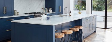
A return to the renovated kitchens that “catch” us a little closer makes us see that kitchens become discreet and elegant (whether they open to the living room or not) after a reform and they usually bet on putting a warm note in the form of wood and different ways of lighting it. Coconas aren’t just a cold, white-light workplace.
New kitchens often play with two finishes, with symmetry and include colors that match the rest of the house.
In white, black, gray, blue or green (but without fanfare). If the kitchen furniture the kitchen module can be “confused” with a sideboard or a kitchen shelf, -as in this kitchen in a recently renovated house in Barcelona- better than better.
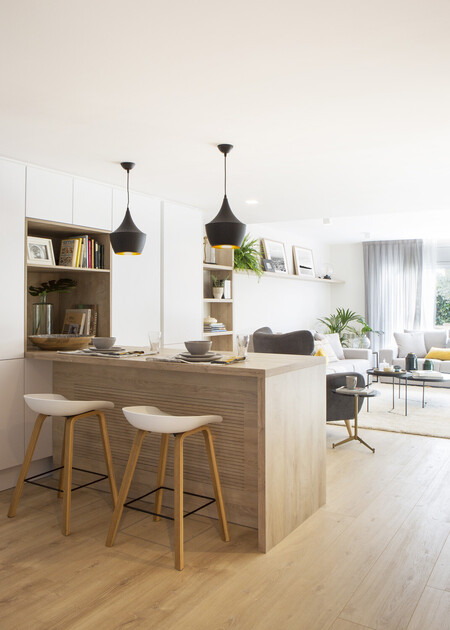
Image Jordi Canosa. Pia Capdevila project
Here are some newly renovated kitchens what do they have in common lack of handles, the purity of the visual lines and the warmth in the form of adequate lighting (led) and / or wooden details.
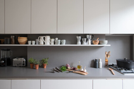
Jack Trench Jt project image
Very strong vertical and horizontal lines in a kitchen to cook in parallel.
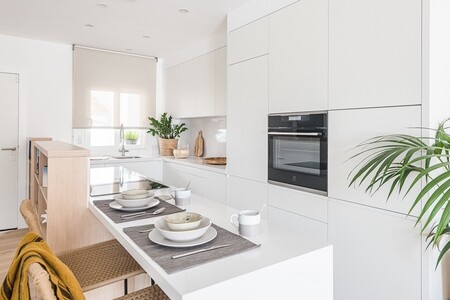
Image by Merce Gost. Tinda’s Project
Blank again, on this kitchen of this townhouse in Empuriabrava, the island continues on an open wooden shelf.
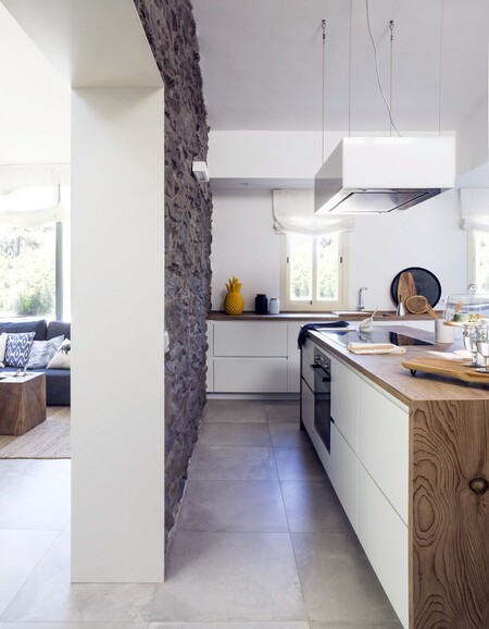
Image by Jordi Canosa Project by Pia Capdevila
The kitchen of this house in Mallorca designed by Pía Capdevila It is semi-open to the rest of the house and, in addition to the wood, it includes a stone wall that stands out better thanks to the refined lines of the furniture.
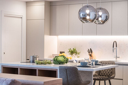
Image Mercè Gost. Via Tinda’s Project.
In this Barcelona apartment, the warm lighting under the tall kitchen cabinets and the lights over the island create a very warm atmosphere in this open kitchen.
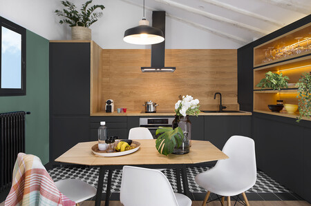
Image of Vicuyo. Egue & Seta Project
In this kitchen of a small apartment in Malasaña Egue y Seta plays with colors and horizontal lines (in the paint and on the furniture) to integrate the kitchen with the dining room and living area.
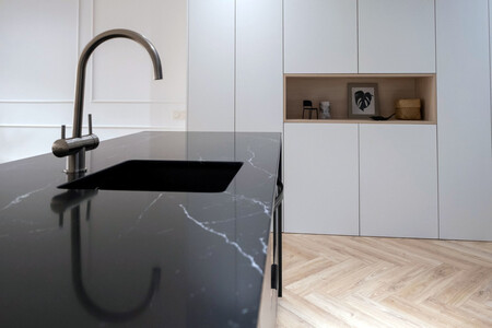
Image and project Peanut Design Studio
A kitchen in Valencia, which manages to integrate into the living room with the refined lines of the furniture that frame it.
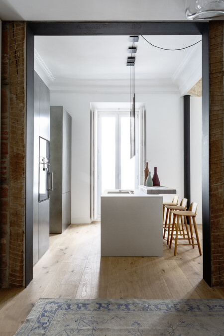
From Abaton and Batavia
In Madrid, this beautiful apartment by Abatón and Batavia, mixes materials (cement finish in tall units) and white lacquer in an open kitchen designed in detail.
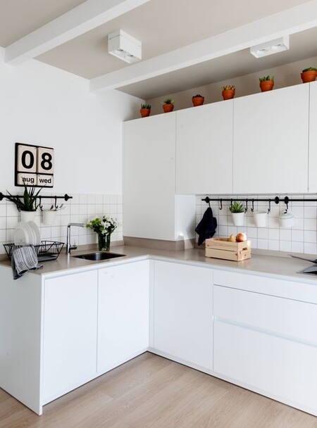
Image by Felipe Scheffel. Natalia Zubizarreta Project
Interior designer Natalia Zubizarreta signs the comprehensive reform of this apartment in Bilbao, in which the lines generated by the encounters and finishes are lengthened (as the dashboard plinth also runs through the cabinet above the worktop), creating the optical illusion that the front is continuous.
Cover image of the El Corte Inglés kitchen catalog.
Similar in Decoesfera | Ikea catalog preview 2021; the best news for your kitchen that we will find in the next catalog
Five luminaires for five designer kitchens


