This kitchen had before its reform some clear protagonists; the 70s tiles on the walls and backsplash that were too heavy and overloaded the room. The old graphic motifs depending on their design, their colors and their application can even give personality and be compatible with white furniture and a clean design but in this case. The brown tones and the abuse of graphics on the floor and walls made the kitchen, in addition to being an old space, a somewhat stressful space.
The destination of the house in which it is located was going to be renting so its owners resorted to Ana Lorenzana from @decoryver for one of your reforms without works to make your home more attractive ey revalue your property.
Something that they achieved almost without renovations (some of their tall furniture and the cabinet doors were changed). So now, this colorful kitchen becomes a kitchen that conveys cleanliness and peace that it lacked before the renovation.
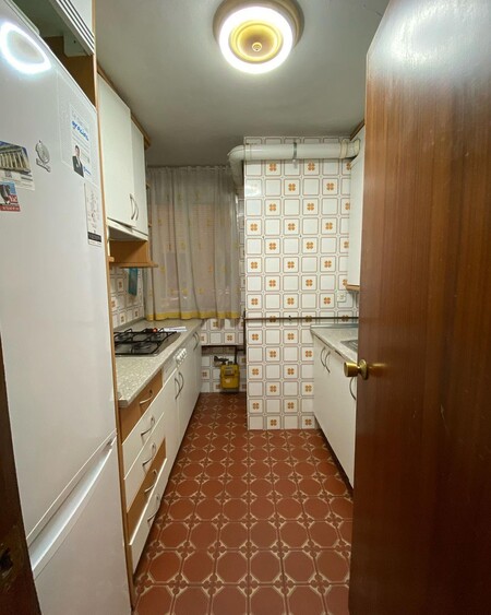
The kitchen before
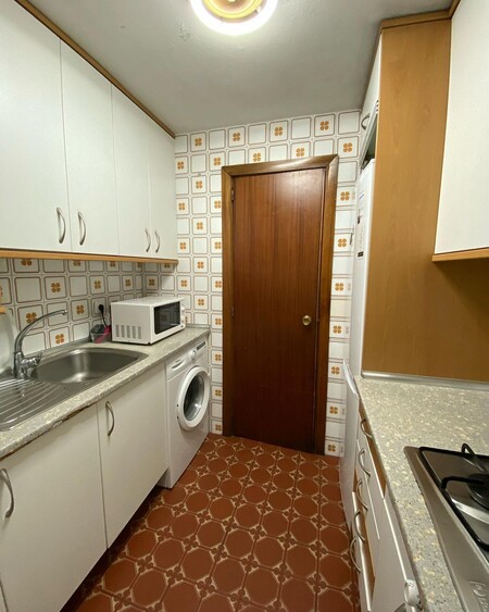
In addition to the obvious (the pattern on the floor and walls), the kitchen had many details that gave years to the kitchen such as the furniture cornice, the dark door, the exposed boiler pipes, the curtains and especially the fluorescent light ceiling (also very from the 70s). None of these elements had been renovated in many years, which enhanced the feeling of neglect in the kitchen.
The kitchen after
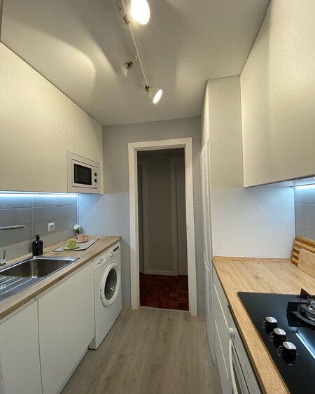
Just by covering the floor and tiles with light tones the kitchen has achieved a great change and now the kitchen is a new brighter space. In addition to the light tones of the new coverings, the light is also enhanced thanks to the white blind that now covers the window and a new track spotlight that better distributes the lighting.
The old ground has been covered with a wood finish vinyl and on the walls has been applied a tile paint of a relaxing and elegant light gray.
The distribution of the furniture and appliances have not been modified, but the previous doors have been replaced by a white model without handles and now the kitchen does not have cornices.
The upper cabinets have been modified and It has been used to fit the microwave in its lower part so now the worktop has been cleared.
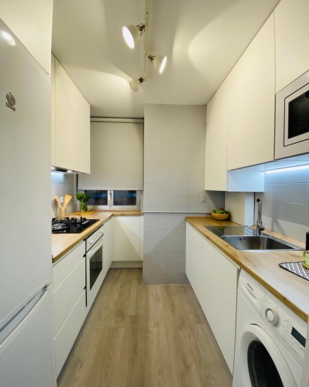
The new countertop (which imitates wood) and some details such as the white painted carpentry complete a round change and where there was an old seventies kitchen now the tenants of the house can enjoy a pretty nordic style kitchen and of marked straight lines.
And all, again, thanks to the magic of @decoryver.
It has inspired us:
A vinyl floor similar to the one used in this reform from € 13.19
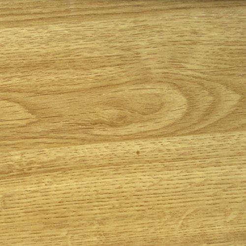
Venilia 53328 Perfect Fix – Lightweight Adhesive Film for Oak, Furniture, Wallpaper, Natural Wood Look, PVC 45 cm x 2 m, Thickness: 0.15 mm
A more sculptural tap with straight lines from € 59.99
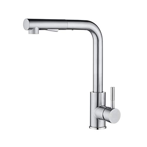
CECIPA Thor I Extendable kitchen tap I Stainless Steel I 2-function tap spout
From Bruguer, a gray tile paint. ARTICO 750 ML € 23.55
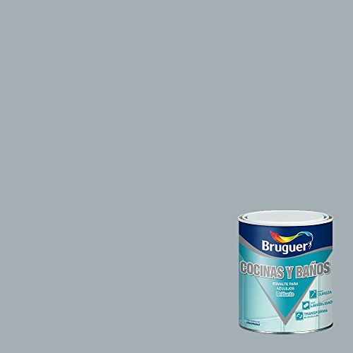
BRUGUER Gray Enamel Tiles ARTICO 750 ML
4 Adjustable Spotlights Bar for € 48.99
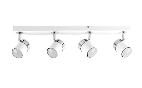
MiniSun – Modern Ceiling Lamp – Bar with 4 Adjustable Spotlights – White Color – Light Strip – Indoor Lighting
Similar in Decoesfera | The Before and After of a kitchen without works to update it and gain in style
Before and after: a small bedroom that grows in visual space and personality

