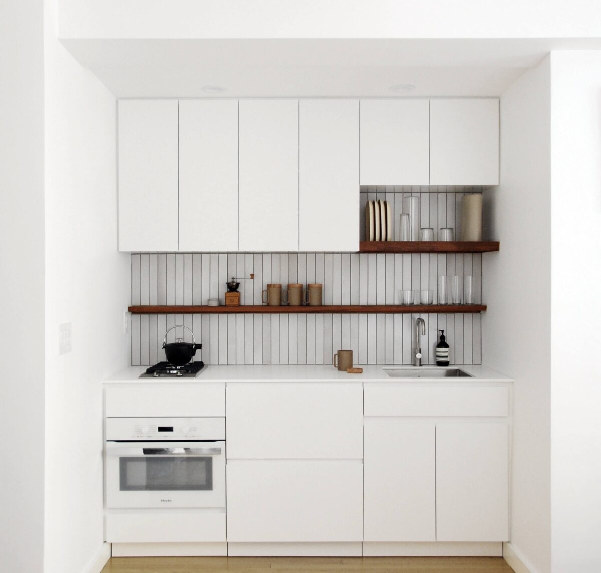
A small kitchen is interesting and nice on the one hand, but on the other hand it can become a nightmare if mistakes are made in the design phase. Which? Let’s find out together in this guide to the mistakes not to make when furnishing a kitchen of a few square meters.
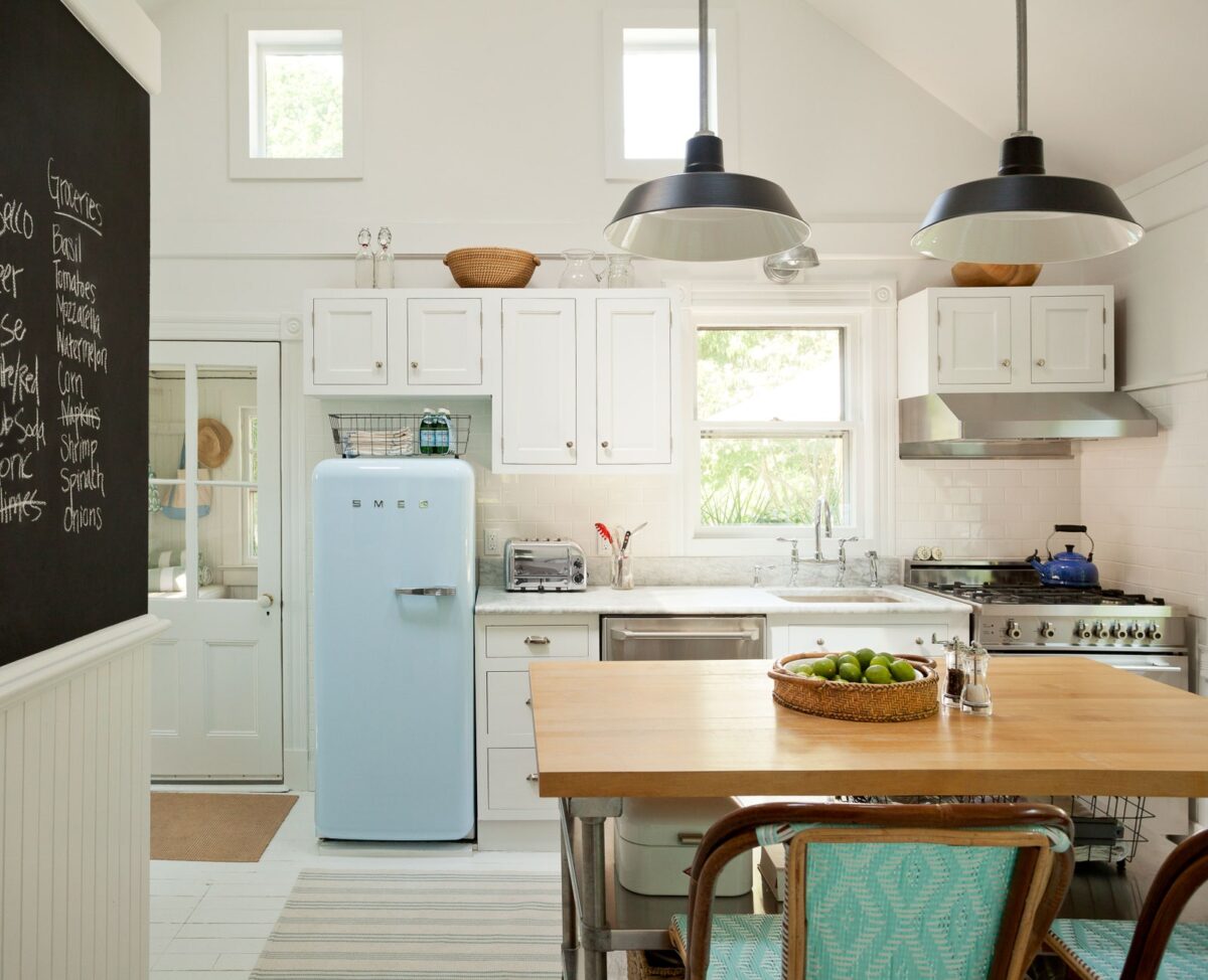
Each dream house has a miniature kitchen which, in addition to being small, is also super-equipped. Is it really a dream or could it come true? Obviously the second option is the one we prefer. In the design phase, reorganization or setting up a kitchen of a few square meters, it is essential to calculate everything – from useful spaces to possible intended uses – to ensure that to the kitchen nothing is missing despite being small in size. How to do? Just follow these few guidelines present in the vademecum below. Enjoy the reading!
Common mistake in a small kitchen: choosing the wrong colors
The colors absolutely to avoid in a small environment, especially if it is a kitchen, are the dark ones. Black, anthracite gray or mouse, green, blue and so on become our enemies. The same goes for overly charged colors such as orange, red, brick etc. Prefer, on the other hand, for a small room, the light shades that they give brightness and amplify the natural light of the room. Warning! We are talking about light colors for the whole environment: walls, floors, furniture, doors and windows.
Read also: Birdhouse: how to attract them to the home garden
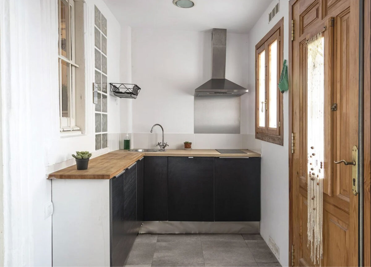
Do not take advantage of the cm of height in the kitchen
Now the latest fashion provides kitchens designed and rearranged without wall units. But the trend doesn’t always match the needs of every room and home, so better to opt for of the solutions that combine comfort to design. If the size of the kitchen is small, It would be a great error limit yourself e do not exploit the cm of height present in this environment.
Go ahead to wall units, organizers, shelves, racks and everything that can help us to find the necessary comfort for all the useful tools. A great idea are niches: alternating them with the wall units and shelves, at the same time they exploit the space and give balance by balancing the full and empty – not engulfing excessively a environment not too wide.
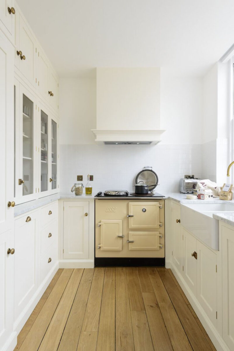
Oversized appliances: a fairly common fail
The balance between dimensions and spaces is absolutely an item to be preserved. About this it is essential to buy appliances – especially the refrigerator! – compact. There is nothing worse than stumbling upon a giant refrigerator in a mini kitchen. Self should you like the contrast between a small room and a large appliance – in this case it is a choice to focus on the accessory – we suggest investing in a design piece, that it marries well with the environment and that it is pleasant in the general aesthetics of the room.
You may be interested in: Garden children’s houses: the most beautiful models
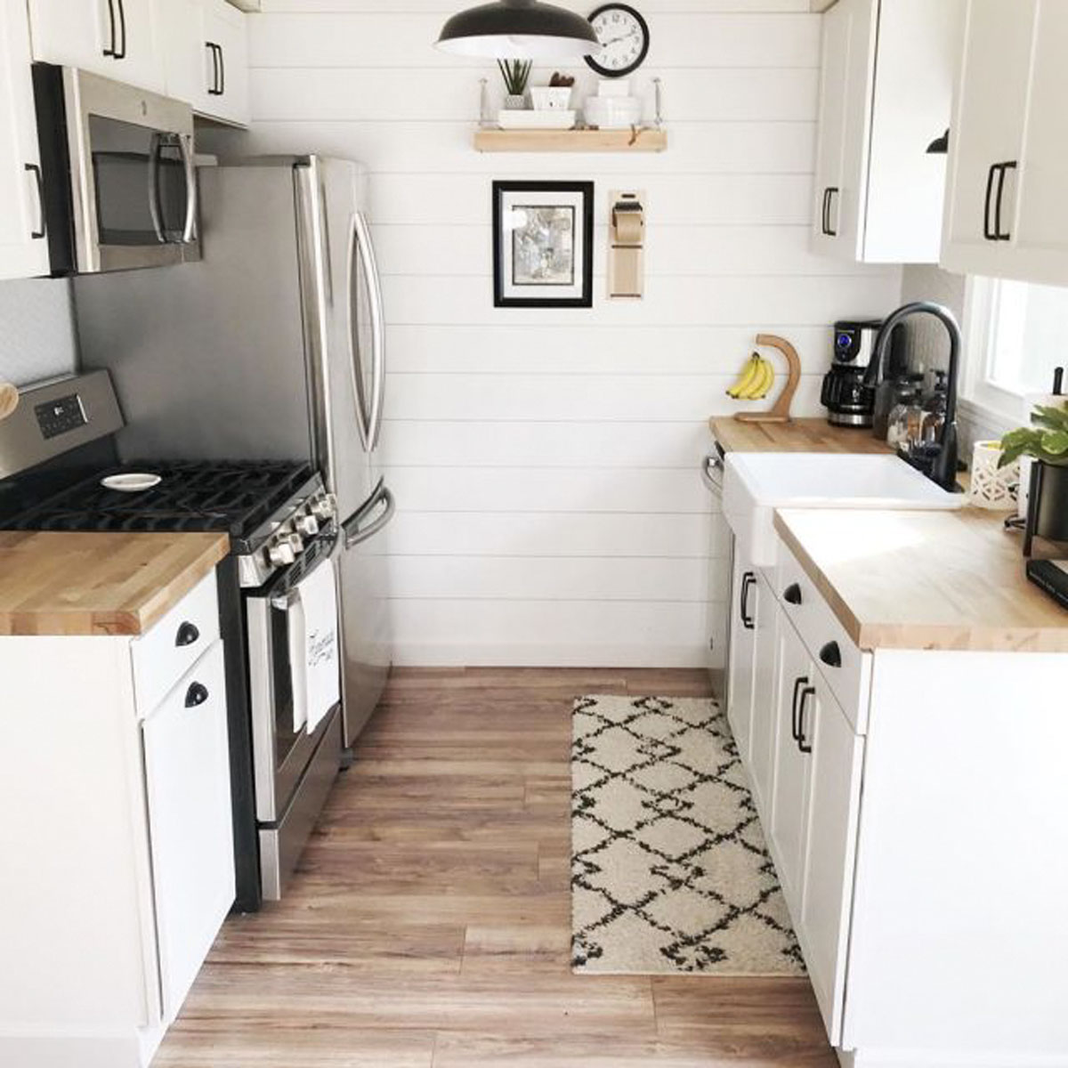
Accumulate and keep everything in sight
If the kitchen is a few square meters, obviously, the furniture to have will be sipped in the environment. Consequently, it is necessary to make a selection of objects, tools and decorations. Not accumulating and decluttering is essential in this case. Each object must have a place specifies, better if inside of a piece of furniture or a belief.
Often, for convenience, there is a tendency to have many utensils on the shelves but this – in addition to creating disorder – in the case of a small kitchen can make the environment seem flooded. Better, therefore, a few useful and hidden objects.
Do you want design advice on how to furnish? Join the group
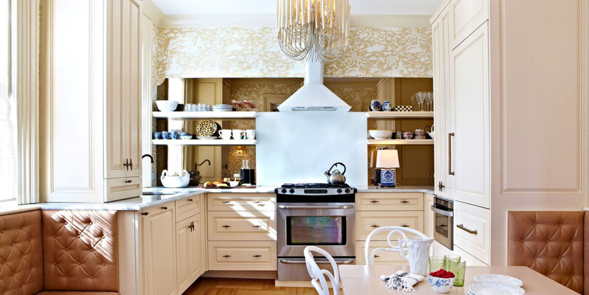
Full-wall coverings
Mistakes are also often made when designing a room, especially when these are the bathroom and kitchen. In line general, if an environment has a few square meters, it is advisable not to coat entirely all walls. The risk of making that room look like a box is really great! To prefer, instead, coatings at half height or even limit them only to the areas where it is necessary – like, in this case, the area adjacent to the stove.
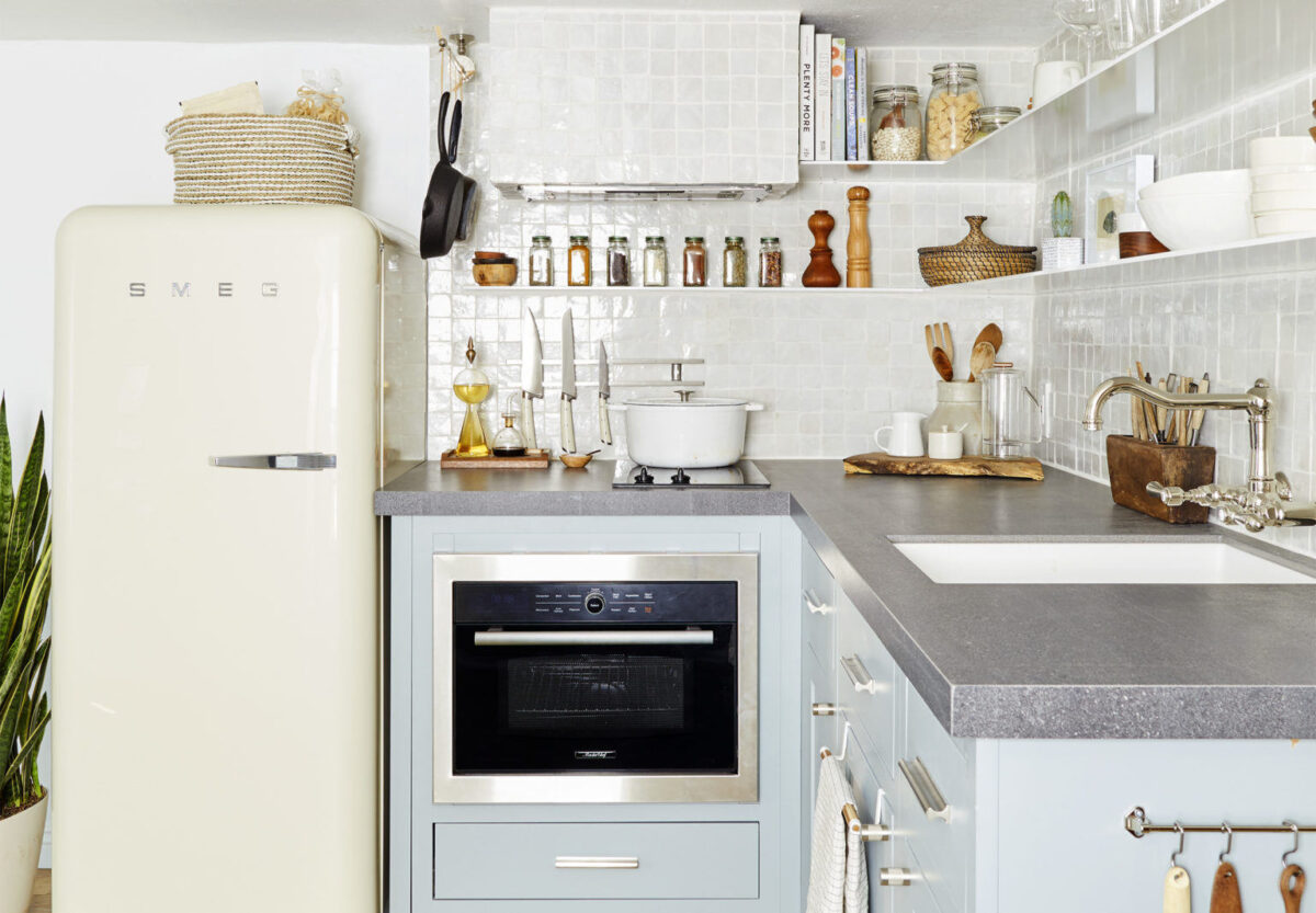
Do not exploit the play of light: a wasted opportunity
Light is a powerful ally of interior design. If used correctly, it can create plays of light that will help the eye to positively perceive an environment. If you have good natural light, exploit it as much as possible without covering it. Regarding instead artificial lighting, it is good practice play on multilevel systems: place light points at different heights and different intensities so as to be able to choose which to turn on based on the occasion.
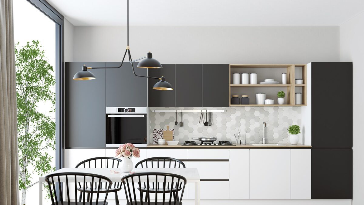
Differentiate the support surfaces: design several levels
If the shelves are scarce, if they can create several on several levels. Green light to trolleys – even if you have to carefully choose the most suitable and least bulky one – small tables or mini islands. Exploit empty corners by choosing elements that are pleasing to the eye it is essential; for example, a cart with spices or aromatic plants will ensure that a wall unit can be used for something else, thus also helping to organize the kitchen.
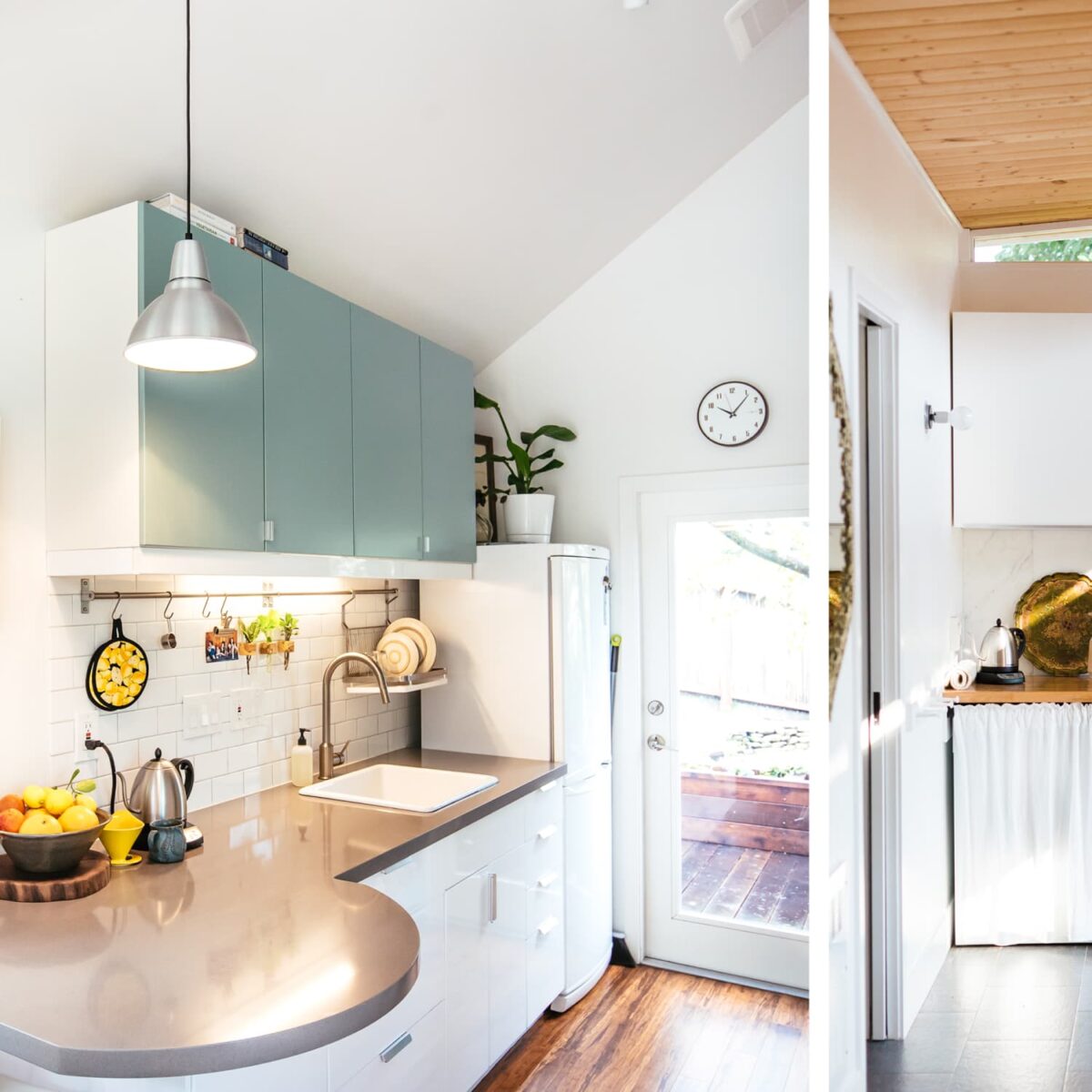
The mistakes not to make when decorating a small kitchen: images and photos
In the gallery below you will find a recap with the most common errors and failures when furnishing a small kitchen. Report all not to commit them!
A small kitchen is interesting and nice on the one hand, but on the other hand it can become a nightmare if mistakes are made in the design phase. Which? Let’s find out together in this guide to the mistakes not to make when furnishing a kitchen of a few square meters.

Each dream house has a miniature kitchen which, in addition to being small, is also super-equipped. Is it really a dream or could it come true? Obviously the second option is the one we prefer. In the design phase, reorganization or setting up a kitchen of a few square meters, it is essential to calculate everything – from useful spaces to possible intended uses – to ensure that to the kitchen nothing is missing despite being small in size. How to do? Just follow these few guidelines present in the vademecum below. Enjoy the reading!
Common mistake in a small kitchen: choosing the wrong colors
The colors absolutely to avoid in a small environment, especially if it is a kitchen, are the dark ones. Black, anthracite gray or mouse, green, blue and so on become our enemies. The same goes for overly charged colors such as orange, red, brick etc. Prefer, on the other hand, for a small room, the light shades that they give brightness and amplify the natural light of the room. Warning! We are talking about light colors for the whole environment: walls, floors, furniture, doors and windows.
Read also: Birdhouse: how to attract them to the home garden

Do not take advantage of the cm of height in the kitchen
Now the latest fashion provides kitchens designed and rearranged without wall units. But the trend doesn’t always match the needs of every room and home, so better to opt for of the solutions that combine comfort to design. If the size of the kitchen is small, It would be a great error limit yourself e do not exploit the cm of height present in this environment.
Go ahead to wall units, organizers, shelves, racks and everything that can help us to find the necessary comfort for all the useful tools. A great idea are niches: alternating them with the wall units and shelves, at the same time they exploit the space and give balance by balancing the full and empty – not engulfing excessively a environment not too wide.

Oversized appliances: a fairly common fail
The balance between dimensions and spaces is absolutely an item to be preserved. About this it is essential to buy appliances – especially the refrigerator! – compact. There is nothing worse than stumbling upon a giant refrigerator in a mini kitchen. Self should you like the contrast between a small room and a large appliance – in this case it is a choice to focus on the accessory – we suggest investing in a design piece, that it marries well with the environment and that it is pleasant in the general aesthetics of the room.
You may be interested in: Garden children’s houses: the most beautiful models

Accumulate and keep everything in sight
If the kitchen is a few square meters, obviously, the furniture to have will be sipped in the environment. Consequently, it is necessary to make a selection of objects, tools and decorations. Not accumulating and decluttering is essential in this case. Each object must have a place specifies, better if inside of a piece of furniture or a belief.
Often, for convenience, there is a tendency to have many utensils on the shelves but this – in addition to creating disorder – in the case of a small kitchen can make the environment seem flooded. Better, therefore, a few useful and hidden objects.
Do you want design advice on how to furnish? Join the group

Full-wall coverings
Mistakes are also often made when designing a room, especially when these are the bathroom and kitchen. In line general, if an environment has a few square meters, it is advisable not to coat entirely all walls. The risk of making that room look like a box is really great! To prefer, instead, coatings at half height or even limit them only to the areas where it is necessary – like, in this case, the area adjacent to the stove.

Do not exploit the play of light: a wasted opportunity
Light is a powerful ally of interior design. If used correctly, it can create plays of light that will help the eye to positively perceive an environment. If you have good natural light, exploit it as much as possible without covering it. Regarding instead artificial lighting, it is good practice play on multilevel systems: place light points at different heights and different intensities so as to be able to choose which to turn on based on the occasion.

Differentiate the support surfaces: design several levels
If the shelves are scarce, if they can create several on several levels. Green light to trolleys – even if you have to carefully choose the most suitable and least bulky one – small tables or mini islands. Exploit empty corners by choosing elements that are pleasing to the eye it is essential; for example, a cart with spices or aromatic plants will ensure that a wall unit can be used for something else, thus also helping to organize the kitchen.

The mistakes not to make when decorating a small kitchen: images and photos
In the gallery below you will find a recap with the most common errors and failures when furnishing a small kitchen. Report all not to commit them!

